


Review: Vasily Kandinsky: Around the Circle @ Guggenheim

With a blockbuster show at an internationally known institution, there’s a presumption that if you don’t like it, the issue lies in your own troubled eyesight and insipid aesthetic values. I walked away from Guggenheim’s Vasily Kandinsky (1866 –1944) exhibit—cutely titled Around the Circle—numbed and bothered. I asked the guard, “You like this?” He replied, “If it were 1910, this would have blown my mind.” The implication being that in 2021 its colors and frenetic shapes look more like the doodles of an overcaffeinated autistic kid bored in math class than something that makes you feel good.
Let’s get this out of the way: Good art makes you feel good. And there were a handful of paintings that imbued me with warmth and satisfaction. There just weren’t enough out of the 62 on display for me not to wonder, “Why now?” The Guggenheim, which has a longstanding history with the artist, last had a show on Kandinsky 10 years ago. Has so much been left unsaid about one of the 20th century’s most famous artists that the public needed another look into the Gug’s basement? It’s worth asking.
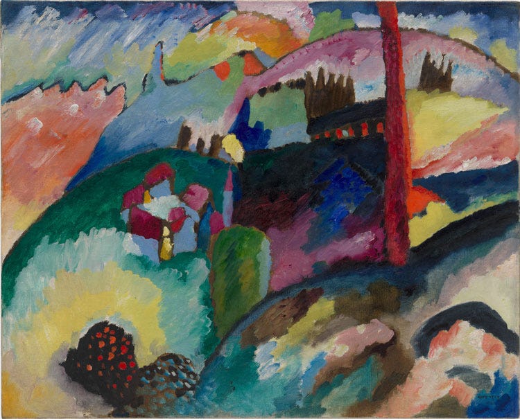
The show—which stupidly begins with the oldest, most uninspired works, circa 1940 and moves backward to his vivid, underrated Neo-Impressionist early work of roughly 1908-1913—deftly recounts the trials of Kandisnky’s unintentional peripatetic life (while leaving out his teenage bride), but it less often explicates what is so great about his work. The colors, the history, the context. Why it is great is already assumed.
I’m not trying to argue that Vasily Kandinsky is not an important or even touching artist, though I feel emboldened in my attack by the fact that Donald Judd, reviewing a Guggenheim retrospective in 1963, said, “Kandinsky is not an artist of the first rank.” There are too many colors to think about that the result is information overload. The compositions themselves are hectic, overcrowded. The sharp shapes don’t allow you to relax.
Kandinsky wrote like a synesthete and so this fact is seized upon. His painting is compared to the music of Arnold Schoenberg. This is true in that it’s atonal. The fussy shapes work—I tend to dislike any of his stuff that isn’t, however vaguely, representational—never reaches the levity that music does. It always leaves you feeling a bit chilled.